THE TASK
Following the award-winning redesign of the visual identity for SuperBest in 2007, Scandinavian DesignLab, in coorporation with Jäpelt A/S, was asked to take on the assignment of further developing the DNA of the identity into a new and more inspiring in-store concept.
The new in-store concept should face the facts that:
80% of all purchase decisions are made in the store
70 % of the time is spent looking and searching for products
60% of the consumers would rather be somewhere else
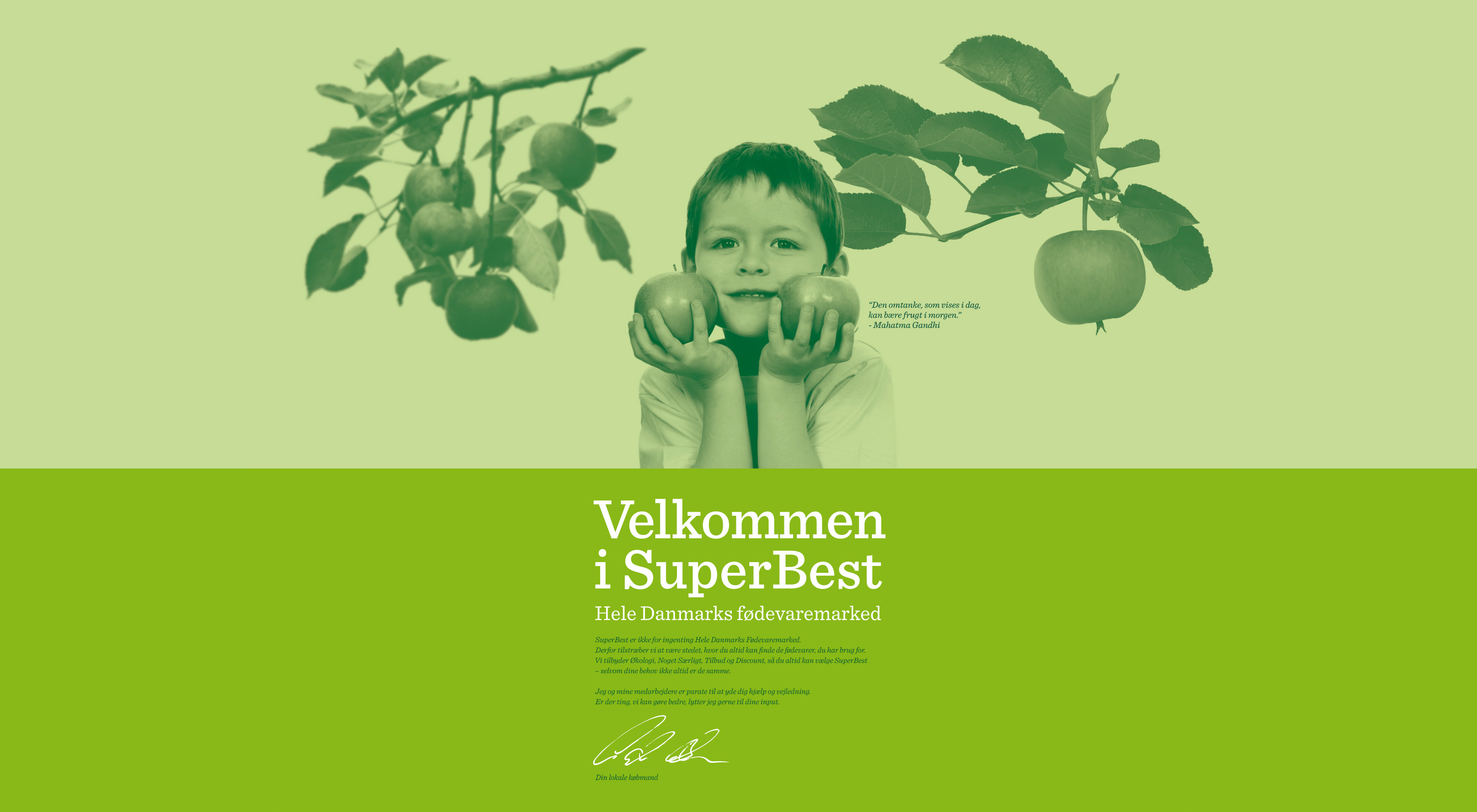
... creating the experience of a modern and competent supermarket rooted in the local community, as well as an accommodating and personal feeling.
THE SOLUTION
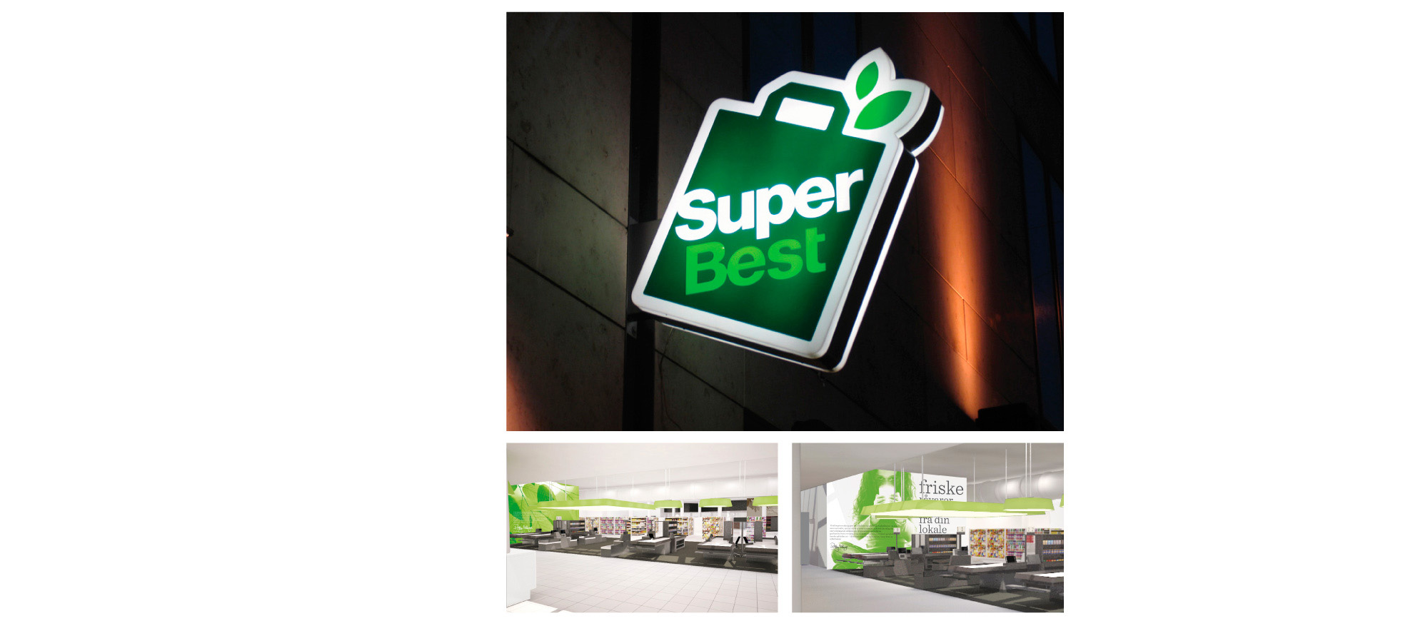
Since the launch of the SuperBest identity in 2007, SuperBest has, via the grocery bag logotype, acquired ownership of the green colour in the Danish retail market.
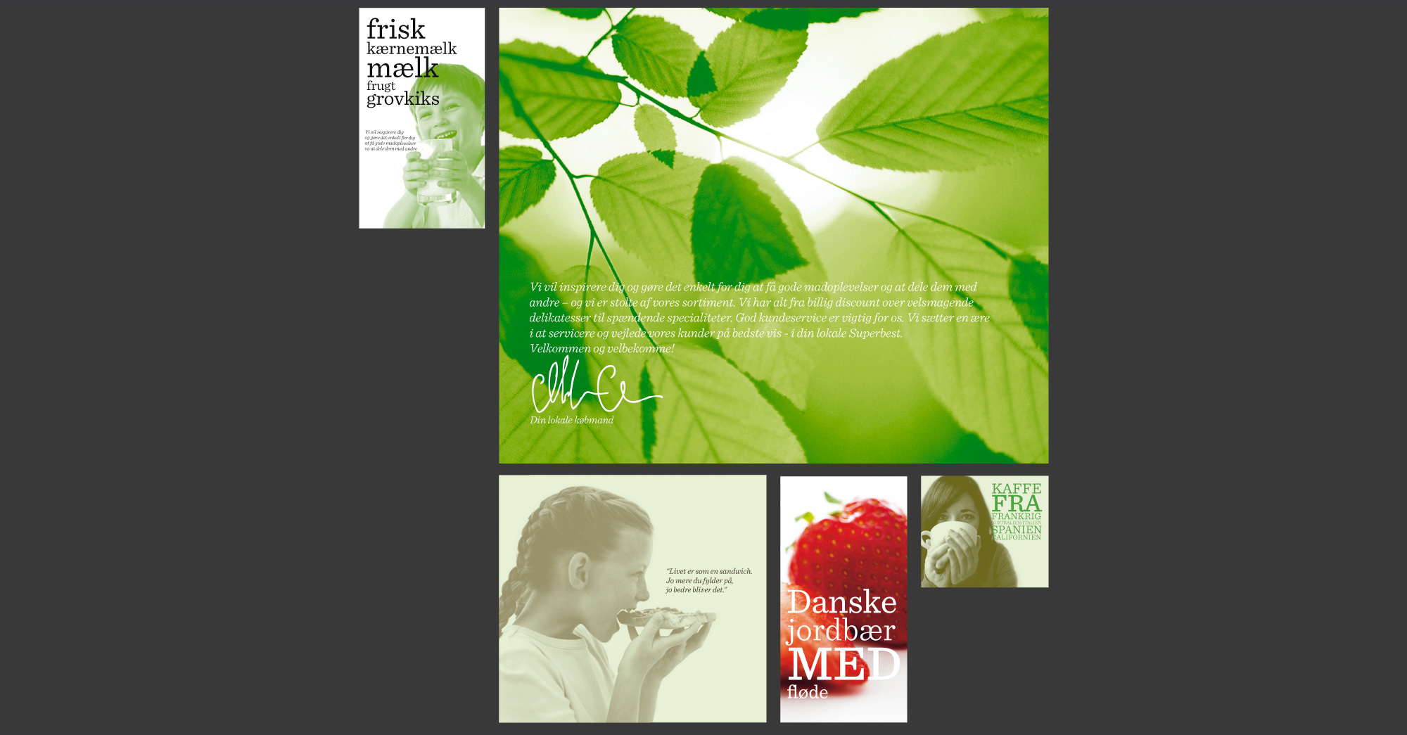
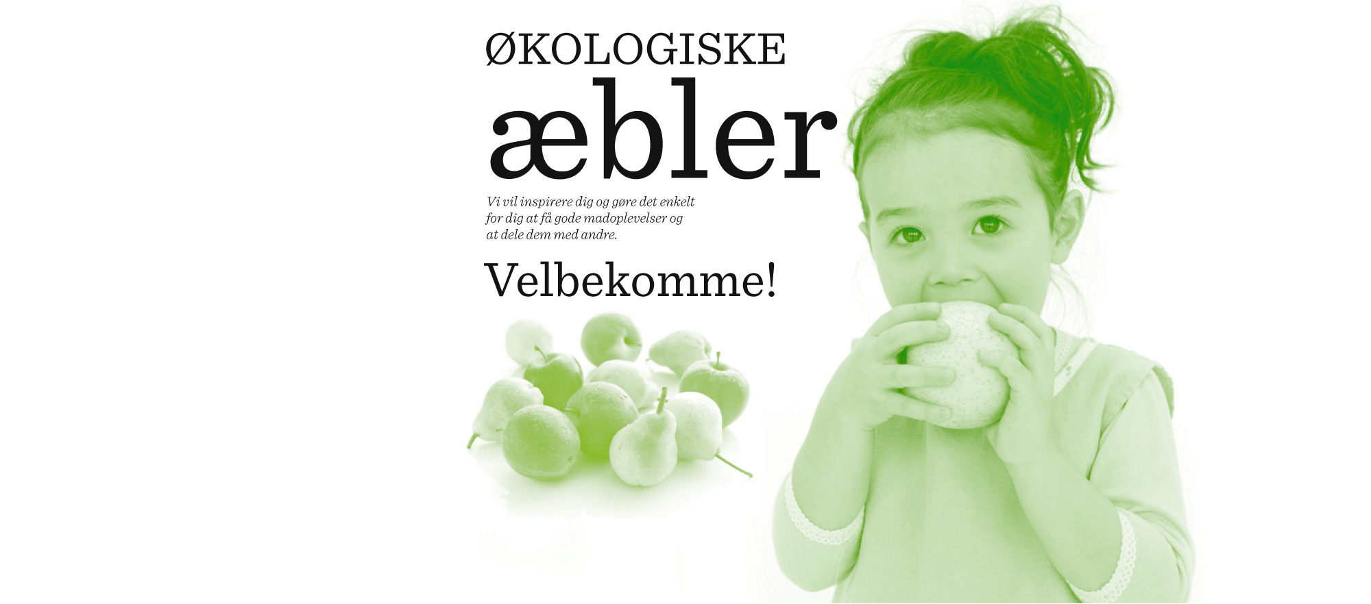
Built on this strong position a new series of green colours, derived from the original SuperBest logo, was developed offering a larger palette to work from and enabling a more soft and transparent look.
The ownership of the green colour was made more significant in store by using the palette on several interior elements such as ceiling lamps, refrigerated counters and wall decorations.
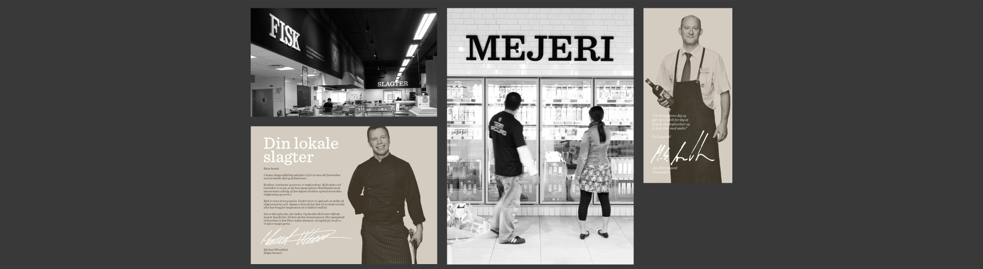
'Sentinel' was added as a secondary typeface as well as handwritten signatures and statements in order to create a more delicate and personal feeling.
Finally, a new photo style was developed, which moved focus from the fresh produce to their origin and the consumers enjoying them. Photos in duotone were applied to large surfaces together with statements and greetings from the grocer and his specialist staff, emphasizing competence and commitment.