THE TASK
During the last two decades, The Kwintet Group has acquired and built up a number of b-t-b work-wear brands, such as Kansas, Fristads and Wenaas, across Europe.
Today, The Kwintet Group is by far the largest supplier of professional wear in Europe. After having launched a new License to Win Strategy in January 2011, an extensive re-organisation of the group was conducted in order to provide easy access to the full scope of Kwintet products and skills for all of the customers. The reorganisation changed the basic structure of the organisation from division to country specific, and resulted in a new brand strategy taking the Kwintet brand out of its former, rather anonymous, life as holding company brand and turn it into a full-blown Corporate Brand.
In order to dress Kwintet for the job, it was decided to create a new corporate identity strategically as well as visually. When the work on the identity was initiated one single mandatory was given by Kwintet; the new identity should clearly express the company’s leading position in the market and the new value proposition.
THE SOLUTION
One major challenge with the Kwintet brand was that it was practically “empty”. It was unknown to many external business partners, and for the ones that knew of the brand it did not carry any strong values. The situation was the same when it came to the employees, who - following the reorganization - all would be employed by Kwintet.
So Kwintet didn’t just need a new logo; the company needed to create and formulate a new vision together with the new identity for the company.
A new vision statement was created together with a new corporate story that ensured a consistent message around the past and the future ambitions of the company, internally as well as externally.
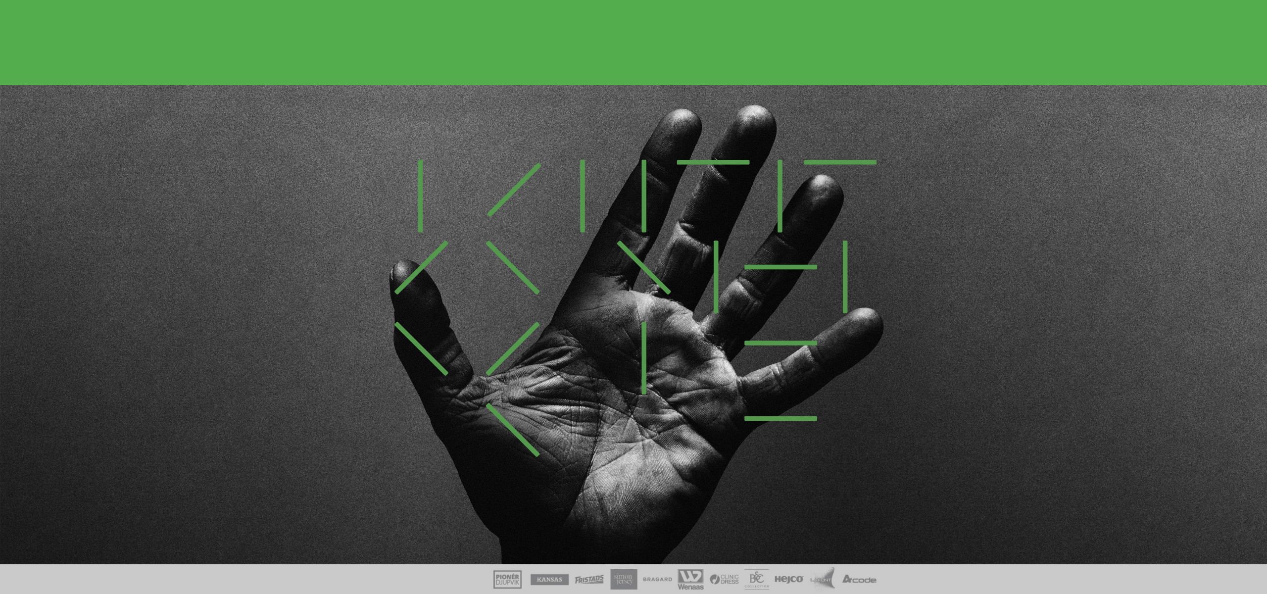
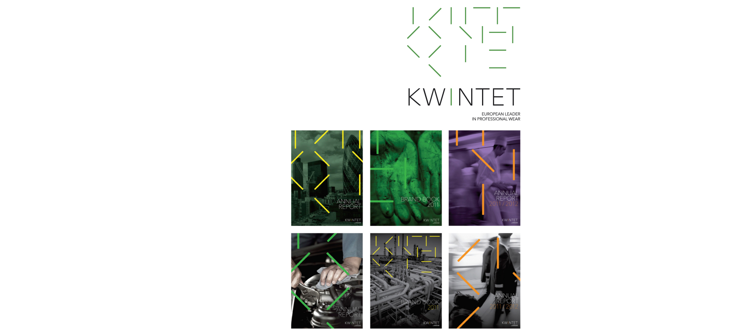
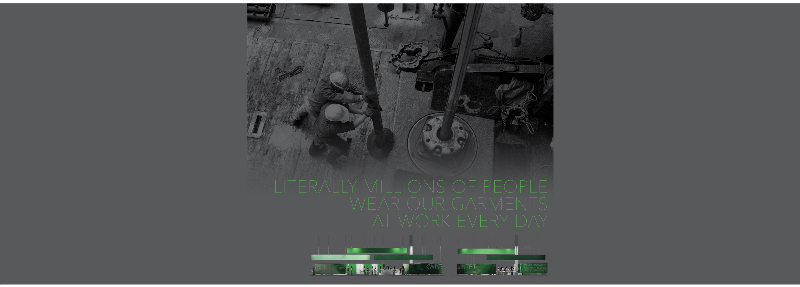
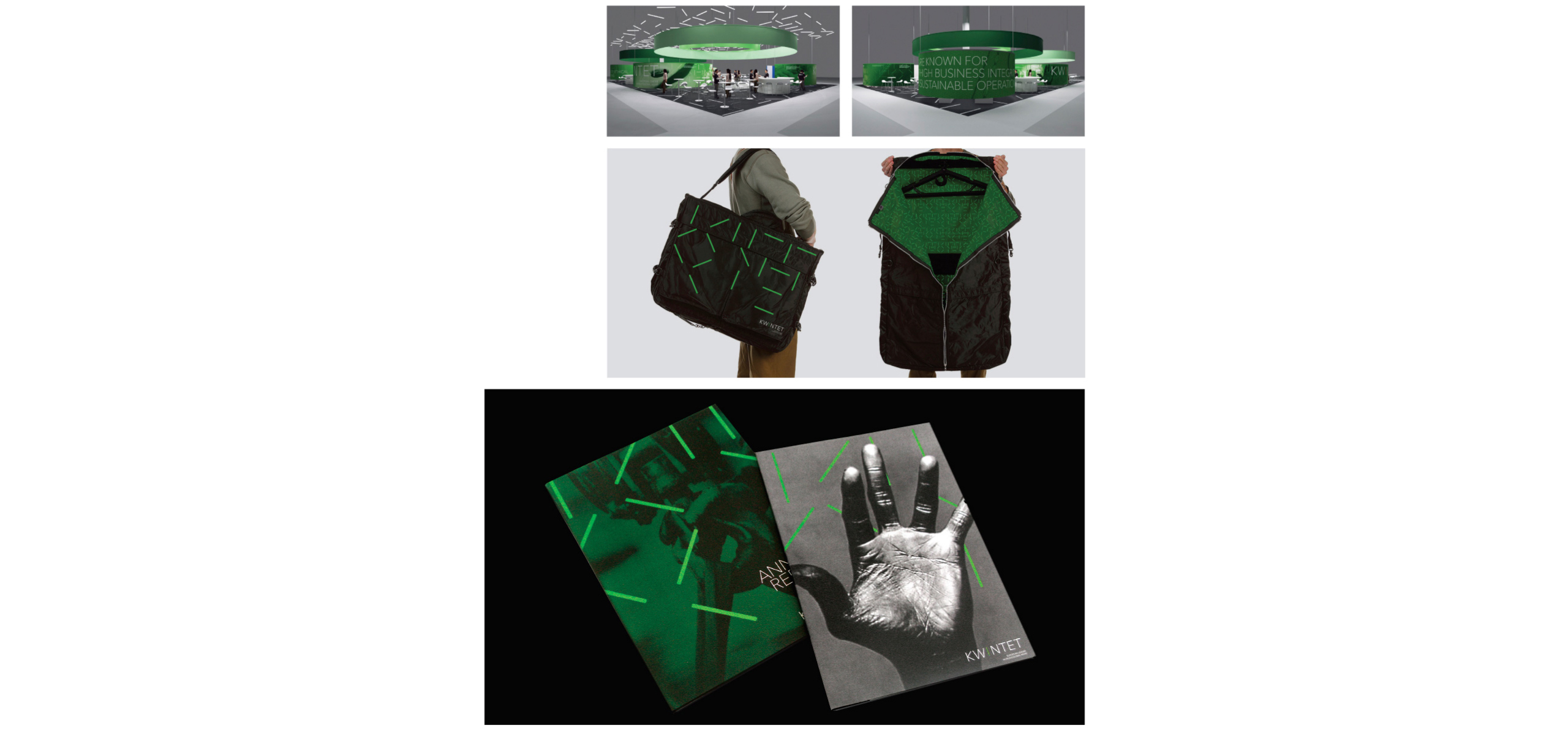
The visual identity was developed in a modern and straightforward visual language. The Kwintet logo consists of two basic elements from which the entire visual identity originates; a logotype and a symbol made up by the lines in each of the letters in the logotype. The symbol reflects the line of business the company is in – professional wear – by creating abstractions on garment stitches.
But even more importantly, the symbol illustrates how the company’s broad offering of brands, products and skills can be combined in numerous ways to fit the individual needs of each customer, and expresses what Kwintet is all about: combining various elements to create unique, united solutions.